Adelaide and Hills Bookkeeping Rebrand
Acquired bookkeeping firm with a legacy brand that signalled the wrong thing. Repositioned, redesigned, and wired up an automated lead pipeline — without touching the name.
Adelaide and Hills Bookkeeping Rebrand
At a Glance
- Client: Adelaide and Hills Bookkeeping (AHB)
- Project: Brand transformation, identity system, website, lead-gen automation
- Timeline: March 2024 kickoff, October 2024 full public launch
- Scope: Brand strategy, logo and identity system, brand guidelines, website, signage, Zapier automation and lead pipeline
- Key result: Repositioned from paper-trail bookkeeper to cloud-first firm; automated lead pipeline generating target-persona inquiries; ongoing care plan in place
Problem
Brendan and Belinda Connolly acquired Adelaide and Hills Bookkeeping as a strategic investment — an established local firm with an existing client base and a brick-and-mortar presence in Adelaide and the Hills. The acquisition made commercial sense. The brand that came with it did not.
The existing identity was a trademarked mark: “AHB” rendered in the shape of Australia, though the execution looked closer to Arabic calligraphy than a map. It was dated, confusing, and signalled everything the new owners weren’t: cautious, difficult to apply, unclear. Their vision for AHB was the opposite. They wanted to lead with cloud technology and win a specific kind of client: mid-30s tradespeople, primarily electricians and plumbers, whose businesses were generating revenue but whose bookkeeping was being handled by a partner at home between childcare duties. That client needed someone who could take the chaos off the kitchen table — and the brand needed to make that promise credible at first glance.
The strategic tension was sharper than a typical rebrand. Brendan and Belinda also own Pax Advisory, which handles the growth-partner, CFO-adjacent end of the market. AHB had to be clearly distinct: complementary in ownership, different in positioning and audience. The name “Bookkeeping” is actually useful here — it signals accessibility and specialisation rather than competing with the advisory-tier offering next door.
Scope and constraints:
- Budget: under $10k across brand and website
- Kickoff: March 2024; brand active in digital signatures by July 2024; full public launch including directory listings, signage, and physical collateral: October 2024
- Existing client base who would experience the transition — the rebrand had to signal evolution, not abandonment
- No existing brand assets worth retaining except local name recognition under “AHB”
Approach
1. Decided to reposition, not rename
The first decision was whether to rename. With Pax, renaming was the core move. Here, keeping “Adelaide and Hills Bookkeeping” made commercial sense — local name recognition, existing SEO equity, an established client base. Changing it would have meant starting from scratch on all of that.
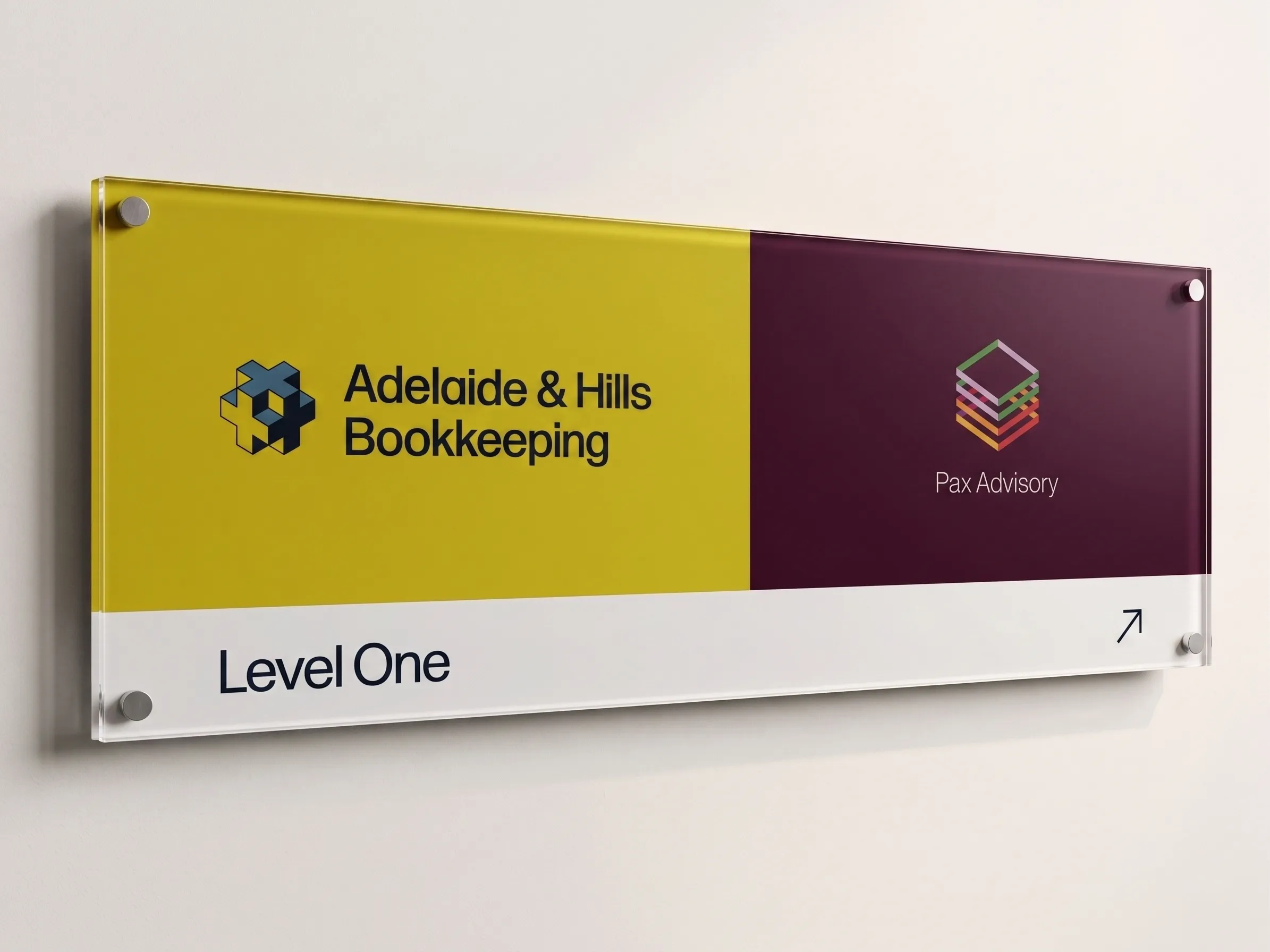
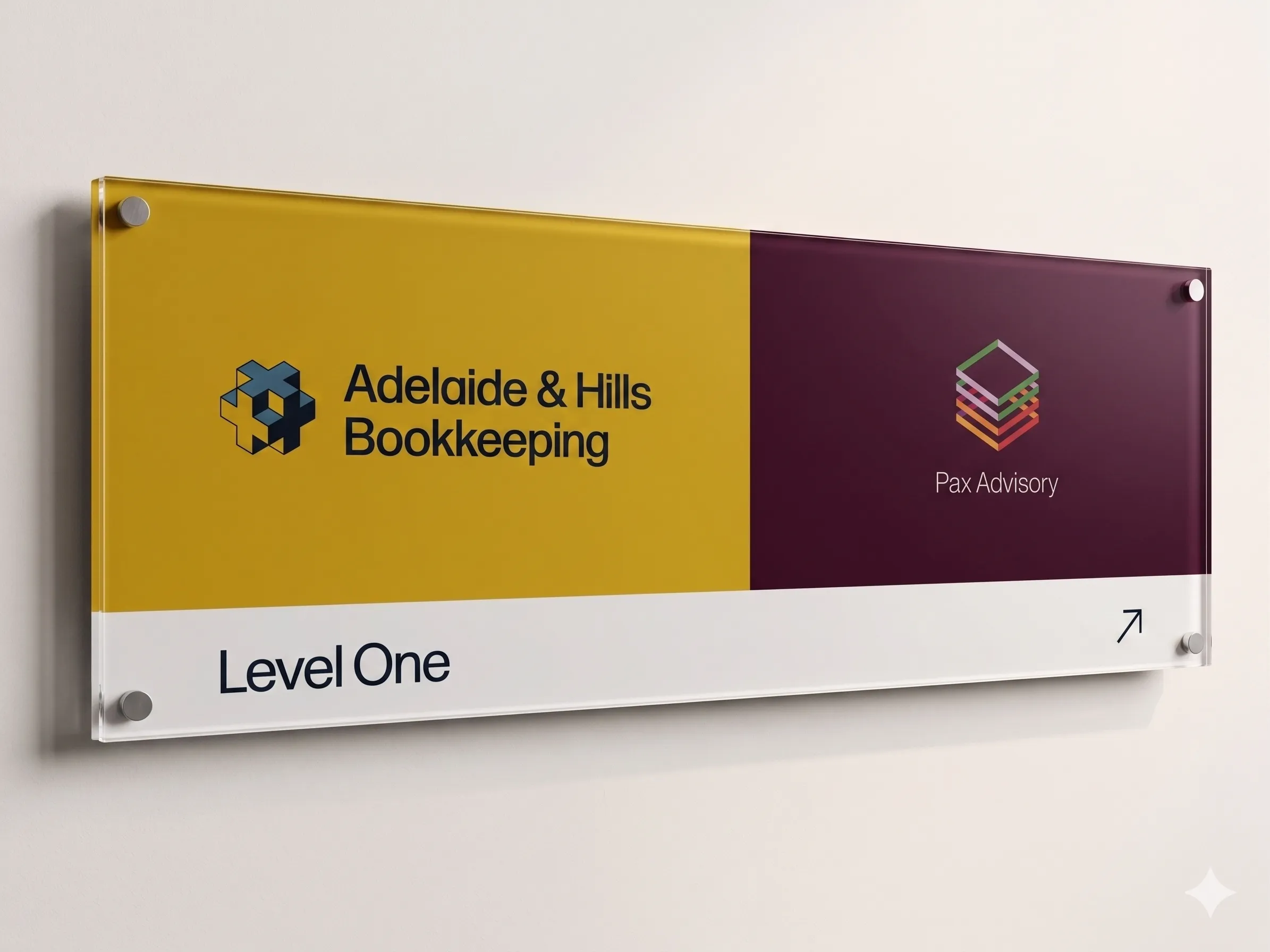
The alternative was to treat the name as neutral territory and fight the repositioning battle through everything else: visual identity, messaging, tooling, and tone. That’s the choice I made. It also clarified the relationship with Pax: one firm handles the books, one handles the strategy. Different names, different audiences, same ownership. That distinction needed to be visible at a glance.
2. Drew the target persona out in session one
The “mid-30s tradie” persona didn’t come from demographic research. It came out in the first session because I was asking the right questions and listening carefully to the answers: not “who is your target market?” but questions that surface the real picture — what a typical new client looks like, what their actual problem is, what their day looks like when things aren’t working. I prompted, pushed, and reflected back until the picture was specific enough to build on. The description that emerged was precise: the typical target client runs a productive trade business (electrical, plumbing), is time-poor, and has their partner doing the books at home between childcare. The pain isn’t that they don’t understand bookkeeping. It’s that bookkeeping is consuming time and attention that should be going elsewhere.
Getting that detail early shaped everything. “Magic, No Wand Needed” became the secondary messaging pillar: the transition from manual paperwork to a cloud-integrated system (Xero, ServiceM8, Tanda, Deputy, Dext) feels like magic to that client. They don’t need to understand what’s running under the hood — they just get their evenings back. This framing shaped the website copy, the services positioning, and the tone of the brand guidelines.
3. Built a symbol that felt contemporary, not conceptual
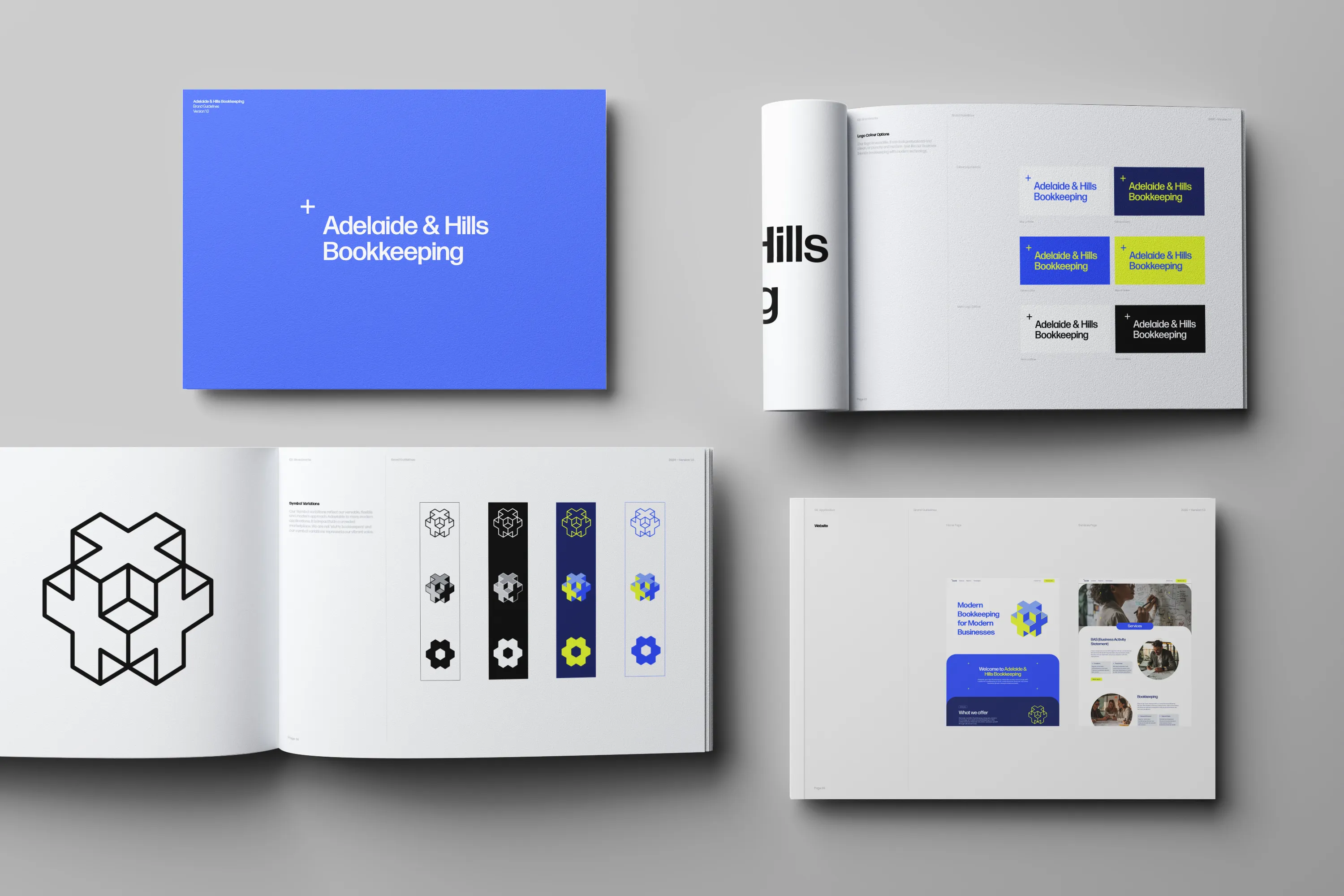
The old symbol wasn’t salvageable. It was trademarked, confusing, and Brendan hated it. A full visual system rebuild was necessary.
I explored many symbol directions. The one that won was a system of plus signs stacked in 2D/3D isometric perspective. The plus is a traditional accounting and mathematics symbol — universally legible — but rendered in an isometric stack it becomes something modern, geometric, and visually distinctive. You don’t see this kind of language in the accounting sector in Adelaide. The goal wasn’t to be clever. It was to make an immediate visual impression that felt right for a young, digitally literate tradie scrolling on their phone.
The colour system: Royal Blue (#304FFE) and Lime Punch (#E8FF30). This combination sits at the opposite end of the spectrum from every accounting firm in Adelaide. Blue is common in the sector; this blue is not. Lime Punch is bold and unusual enough to be noticed. The tradeoff is that it demands confidence from the client — which is precisely the persona the positioning attracts.
![]()
Typography: Forma DJR. Bold and contemporary, legible and grounded. The brand guidelines emphasise clarity, authenticity, and professionalism without rigidity.
4. Solved the imagery problem before the photographer arrived
Brendan was explicit from the start: no stock photography. “I don’t want to see a man sitting at a desk with a laptop. That’s so cliche.” The reference he pointed to was a video from one of his software integrations, Ignition, showing someone writing on a whiteboard — active, real, professional.
Before Brendan commissioned photography, the site needed imagery. I used Midjourney to generate a full set of custom images, each tailored to its specific section or page, all approved by Brendan before going live. Maintaining visual and thematic consistency across a generated set requires genuine prompt engineering, not just iteration. Midjourney’s model depth and stylistic control make it the right tool for this kind of work. When Brendan eventually invested in professional photography, the real-people imagery was stronger — it always is — but the generated set held the launch, and he approved every image in it. For someone notoriously particular about visuals, that was the real test.
5. Built the website to scale, not just to launch
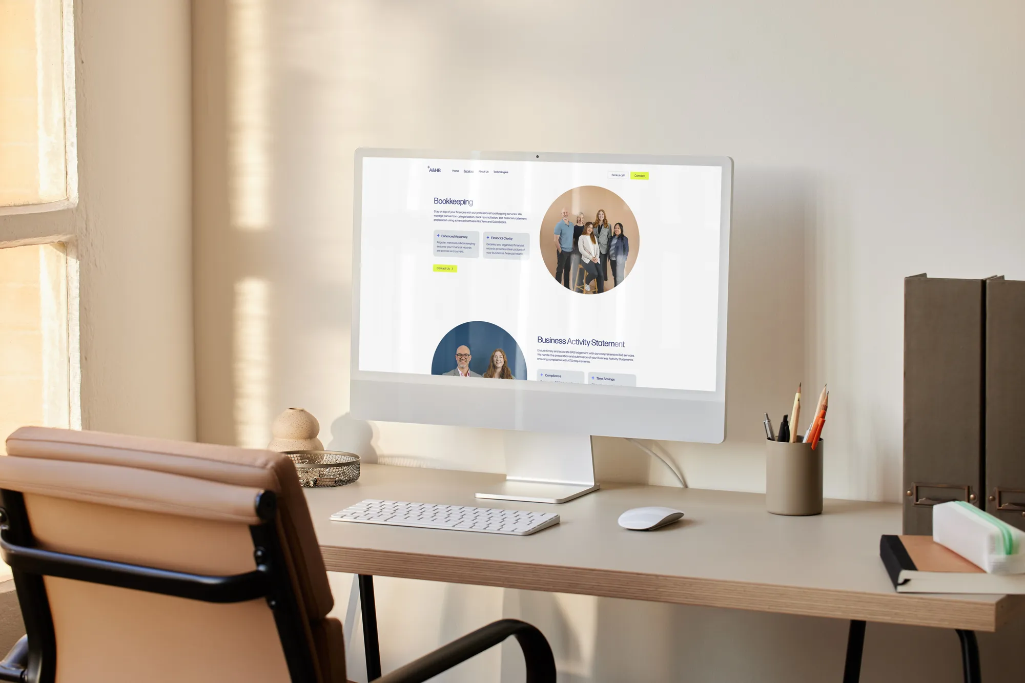
The site launched with five sections: Home, Services, Technologies, About Us, and Contact. Giving Technologies its own page was deliberate — cloud integration is central to AHB’s positioning, and listing Xero Gold Partner status, software partnerships, and the full stack (Xero, MYOB, Deputy, Tanda, Dext, Castaway) in one place gives technically-minded clients a clear signal of capability. As Brendan started running Google Ads, the site was extended with dedicated landing pages targeting tradie inquiries: different entry point, different copy register, same brand system. The architecture made that extension straightforward. A site that can accommodate paid traffic campaigns and split-testing without a rebuild is a better long-term asset than one that launches well but can’t adapt.
6. Set up a single lead collation point across both businesses
Brendan was running seven contact forms across both the Pax and AHB sites. Every inquiry was going somewhere different. I connected all of them to a single Google Sheet via Zapier — one place to see every lead, regardless of which form or which business it came through. I pushed for Google Sheets over Brendan’s preference for Excel because the native Zapier integration was faster to set up, more reliable from day one, and didn’t require extra authentication steps. The tradeoff was asking the client to shift tools. Brendan accepted without hesitation — that level of trust makes a real difference to how quickly good decisions land.
The system is built to extend. Adding AI-assisted lead research, auto-reply SMS or email, or lead scoring are all viable upgrades without touching the core architecture.
The brand guidelines were codified into a Version 1.0 Brand Book in 2024. I also designed both internal and external signage for the new Fullarton office, giving the team a full visual system to work from as they settled in.
Outcome
By October 2024, the full public rebrand was live. Digital signatures, directory listings (Google, Hotfrog, Yellow Pages), website, and physical signage — all updated. The old identity was gone. Covering local directories is something most clients don’t think to ask for; Brendan’s firm is consistently visible wherever a local business search lands.
Commercial result: The rebrand enabled the shift to a fixed-fee advisory model, replacing ad-hoc billing with predictable revenue for both firm and client. Brendan invested in Google advertising and social media to drive traffic to the new brand. I also built out a set of Canva templates matching the visual language for his marketing agency to work from.
The lead pipeline has been producing target-persona inquiries since launch: carpentry businesses, civil and heavy haulage operators, landscaping sole traders. These are exactly the businesses the brand was built to attract.
Operational result: Seven contact forms across two businesses feeding a single lead repository via Zapier. The system is live and running — all inquiries visible in one place, with room to layer in automation as the business grows.
Continuity result: The Brand Book, combined with the signage package, gave the team a complete working reference for the Fullarton office move. The identity held without anyone needing to come back to me for application decisions.
Testimonial
We came to Cameron with a brand that made no sense for what we were trying to build. He got what we needed quickly, didn’t overcomplicate it, and delivered something we’re genuinely proud of.
The website in particular — from time to time I’ll get a call from a supplier or someone in the industry and they’ll say “I had a look at your website, it’s excellent.” That doesn’t happen by accident. Cameron made sure everything was set up properly: the site, the directories, the lead pipeline — all of it.
We’re still working with him. That probably says it all.
— Brendan Connolly and Belinda Robb, Adelaide and Hills Bookkeeping
Why They Needed Me
- This project breaks without the reposition vs. rename decision. Renaming would have cost the firm its SEO equity and local name recognition. Keeping “Adelaide and Hills Bookkeeping” required the brand to do more work visually and tonally — tighter messaging, stronger design, clearer persona targeting — to make the new positioning stick. Without someone who could see that tradeoff at the start, the project either loses the name asset or fails to change what the name signals.
- This project breaks without the persona clarity on day one. “Small business owners” is not a strategy. “Mid-30s tradie whose partner is doing the books between childcare” is. That picture came out in the first session because I asked the right questions and pressed until the answer was specific enough to build on. Without that specificity, the messaging is generic and the landing pages don’t convert.
- This project breaks without a symbol that earns its place. Building a new identity from scratch meant every element had to hold up. The plus-sign stack works because it takes a familiar accounting symbol and makes it feel modern and confident — the right register for the persona, the right point of difference for the market. A purely aesthetic choice would have landed somewhere forgettable.
- This project breaks without the imagery solution before the photographer arrived. A site that launches with placeholder stock would have undermined the whole brand signal. Getting custom, approved imagery through Midjourney — consistently styled, section by section — required enough prompt craft to satisfy a client who is hard to please visually.
- This project breaks without the lead infrastructure. A rebrand without a working pipeline is a sunk cost. The Zapier integration, the unified lead sheet, and the landing pages are what made the brand investment commercially meaningful. Without that layer, the site is a brochure.
- This project breaks without someone who can navigate two parallel clients. The Pax and AHB brands both belong to Brendan and Belinda. They needed to be visually distinct, tonally matched to their respective audiences, and operationally integrated at the back end. Managing that without creating confusion required holding both systems in mind from the start.