AR Energy Website Rebrand
Solar company with a cobbled website that couldn't support their commercial ambitions. Rebuilt the platform, systematised the brand, and gave them the tools to document and share their growth.
AR Energy Website Rebrand
At a Glance
- Client: AR Energy
- Project: Website redesign and brand system, Webflow development, capability statement, social media templates
- Timeline: Jan 2024 to Oct 2024 (social media system added May 2025)
- Scope: Brand strategy, visual system design, Webflow development, custom GSAP case study slider, CMS architecture, capability statement direction, social media brand system
- Key result: Repositioned from residential-focused to credible commercial operator; custom case study CMS built to document commercial projects; AR Energy achieved their Million Dollar Mission within 10 months of launch
Problem
AR Energy is a solar installation firm based in Adelaide. They had grown significantly, taking on large commercial and off-grid projects alongside residential, but their digital presence told a different story. The existing website had been built by a mate on the cheap: a Shopify storefront with no store, being used in a clunky way to publish blog content. It was never the right tool and they had long since outgrown it. The fonts, icon styles, and social media assets all read as casual and residential. Nothing about the brand communicated the commercial capability the business actually had.
Aidan Riley and Brandon Foster wanted to compete for million-dollar commercial contracts. The site needed to match that ambition: professional, credible, and capable of showcasing a growing portfolio of large-scale projects.
Scope and constraints:
- Budget: $10,000 for the website (capability statement and social media were separate engagements)
- Timeline: 9 months from proposal to launch (Oct 2024)
- Stakeholders: Aidan Riley and Brandon Foster, both practical and decisive, they got out of the way and let the work happen
- The platform: replacing a cobbled Shopify setup meant rebuilding from scratch, not iterating
- Existing brand: the navy logo was staying. The work was elevation and systematisation, not a full rebrand
Approach
1. Rebuilt on Webflow rather than patching what was there
The existing Shopify site was the wrong foundation. It had been built as a low-cost stopgap and was being used as a simple blog — no store, no CMS, no design control. AR Energy had outgrown it and needed a platform that could handle a proper project portfolio, a case study CMS, and the kind of custom interactions that signal commercial capability to a building industry audience.
I recommended a full rebuild on Webflow. The tradeoff was a longer, more expensive project upfront. The alternative, improving what was already there, would have made something wrong a little less wrong. Clients often want to stay with what they know. The right answer here was to change the foundation entirely.
2. Built a comprehensive visual system around the existing brand
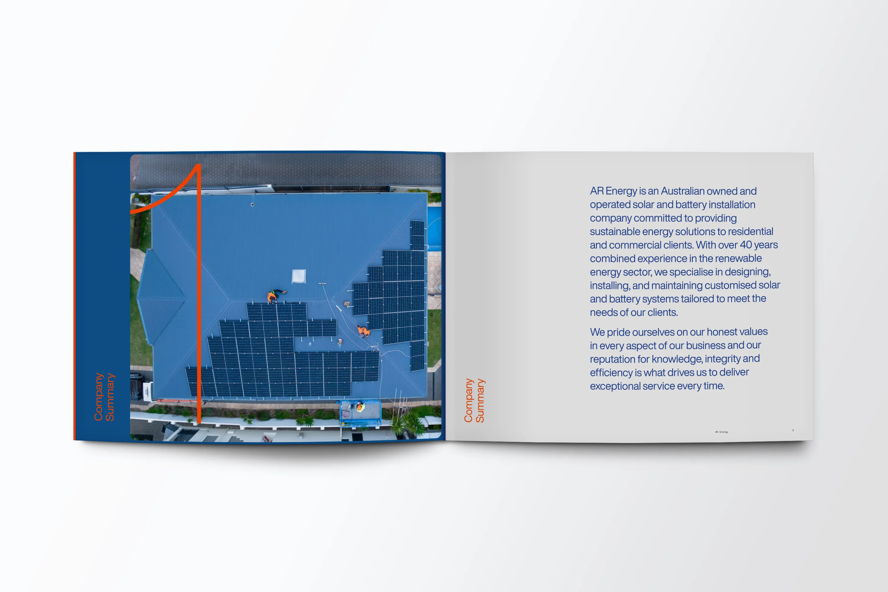
AR Energy wasn’t asking for a rebrand. The goal was to take what existed, the navy logo and general identity, and systematise it into something that could work consistently across every touchpoint: web, print, and graphics.
They had no existing typeface. I selected one, but when the cost came up, the client didn’t want to pay for a licensed font. I went with Manrope instead: bold, contemporary, and free. It was the right call for the register they needed.
I built a full light and dark theme colour system with a considered palette that worked across digital and print contexts. The design language was chosen to break from the casual, high-vis solar company aesthetic without abandoning the brand they had built. Every Adelaide solar competitor looks the same. The visual system was designed to be distinct within that market while remaining credible to commercial clients.
There was one colour choice Aidan questioned early on. I held my position and explained what the colour was communicating to the commercial clients they were trying to reach. Once he understood the reasoning, he came around. A few weeks later: “the colour has really grown on me.” That’s the outcome of pushing back with a clear rationale rather than accommodating every first reaction.
3. Built a custom GSAP case study slider and CMS
The centrepiece of the site is the project case study section: a custom GSAP-powered slider connected to a Webflow CMS that the AR Energy team can update themselves. This wasn’t decorative. Commercial prospects need to see proof of capability at scale, and a properly built case study system, with real project photography and documented outcomes, is the thing that makes a million-dollar tender credible.
Building this meant thinking about how the team would use it as the business grew: easy to add new projects, consistent in presentation, and visually strong enough to let the work speak. A static grid of thumbnails wouldn’t have done that job.
4. Directed creative production across the project
Not all of the deliverables on this project were mine to produce directly. The Capability Statement, a formal document used for commercial tenders, required two rounds of production. The first didn’t match the brief and didn’t read as a credible commercial document. The second was stronger, but the client’s preference was for something more flexible and accessible than the original vision. I made adjustments, held the brand standard where it mattered, and delivered something that worked for the audience it needed to work for.
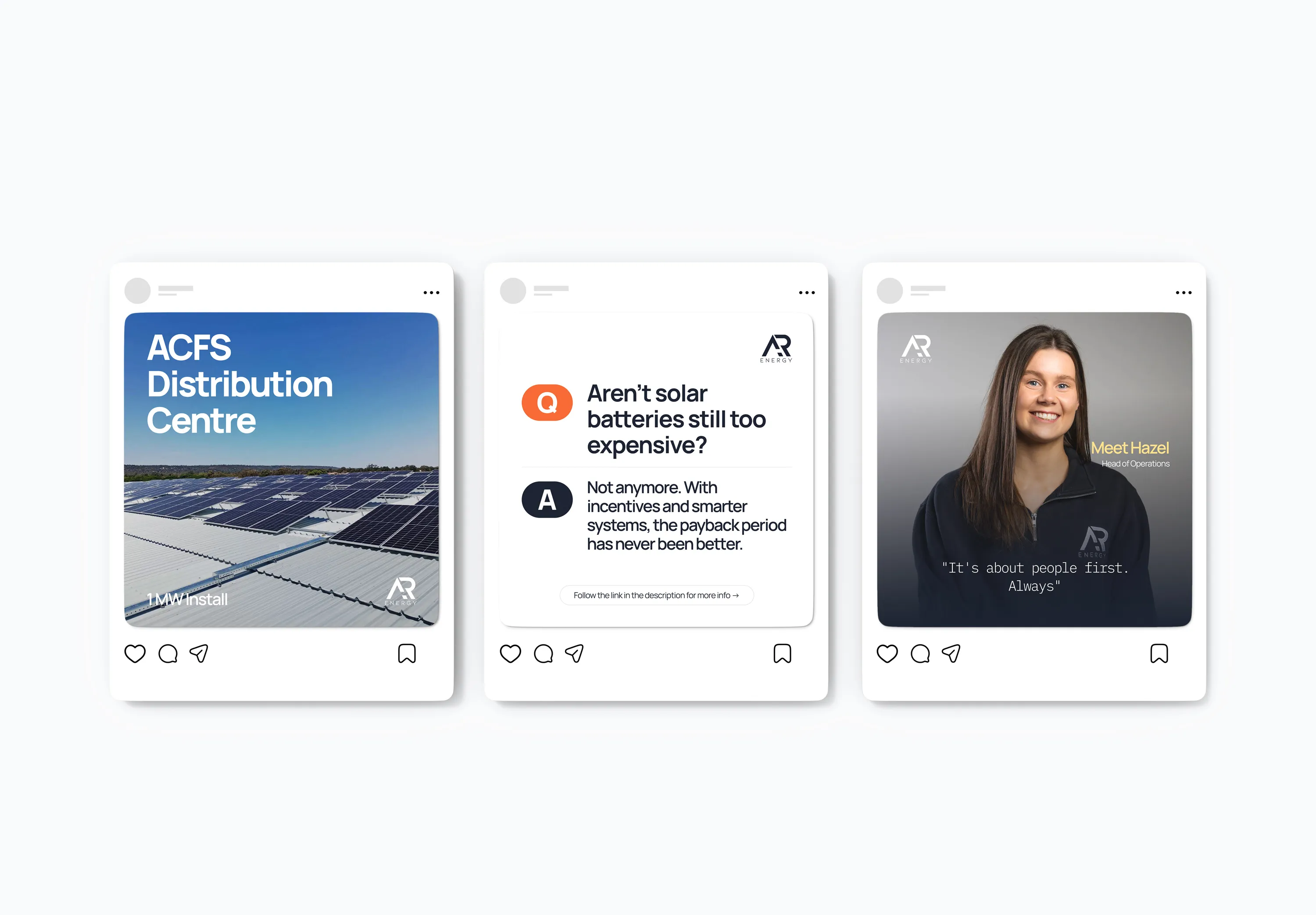
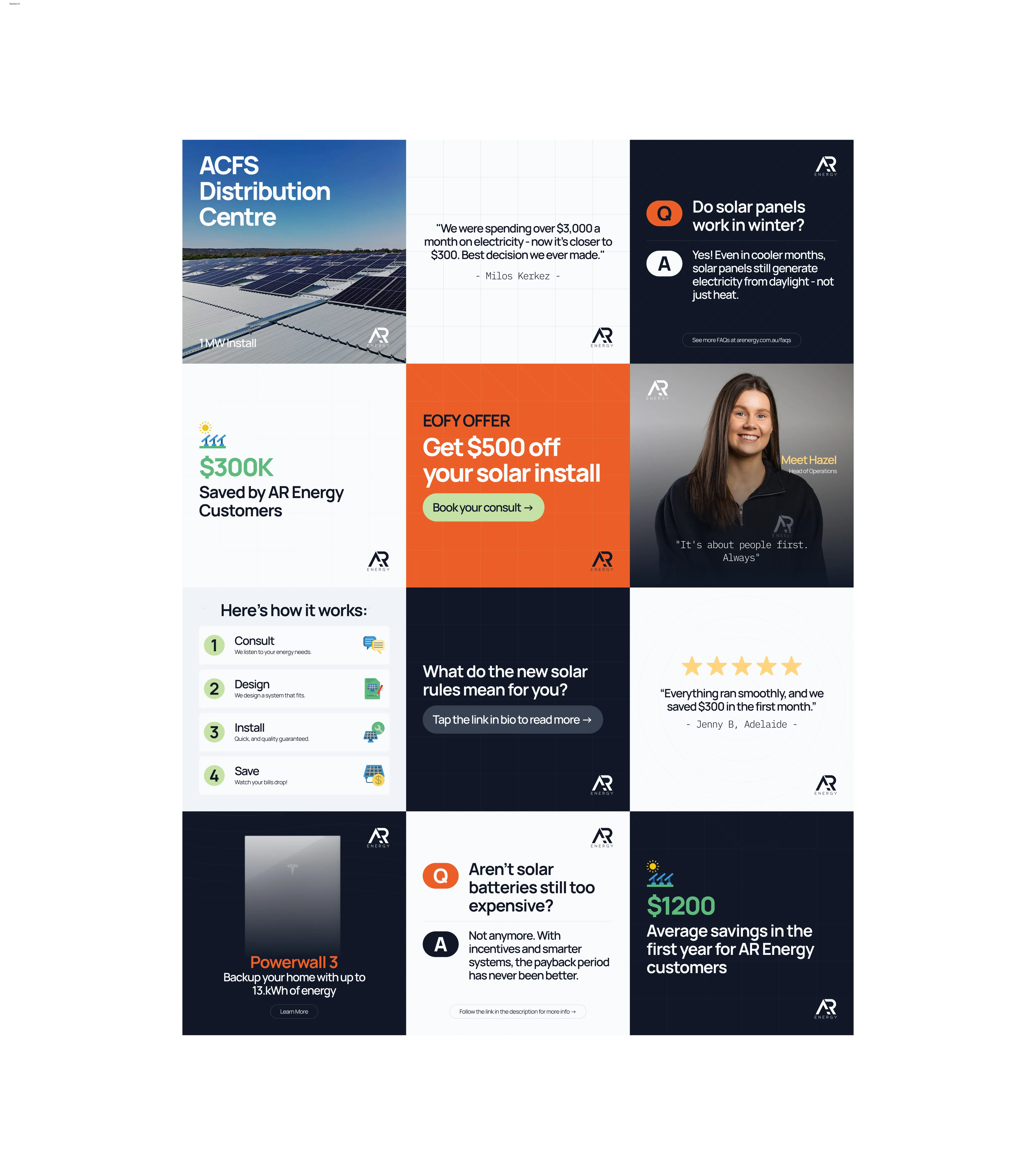
The same directorial role applied to the social media templates that came later. When Format Digital joined as AR Energy’s social media agency, I worked with their team on the Powerhouse Package: 10 flexible tile types, a full social-content brand guide, and a 30-minute walkthrough. Every template followed the visual system. The brand didn’t fragment when it moved into social media because the architecture had been built to extend.
This is the part of the project that goes beyond design and development. Holding quality across contributors, briefing clearly, reviewing thoroughly, and pushing back when something doesn’t hold up, that’s what makes the brand coherent at every touchpoint.
5. Built the landing page for the Million Dollar Mission
In early 2025, AR Energy launched the Million Dollar Mission: a public commitment to save Australian households a total of one million dollars on their power bills. I built the dedicated landing page and navigation banner to support the campaign.
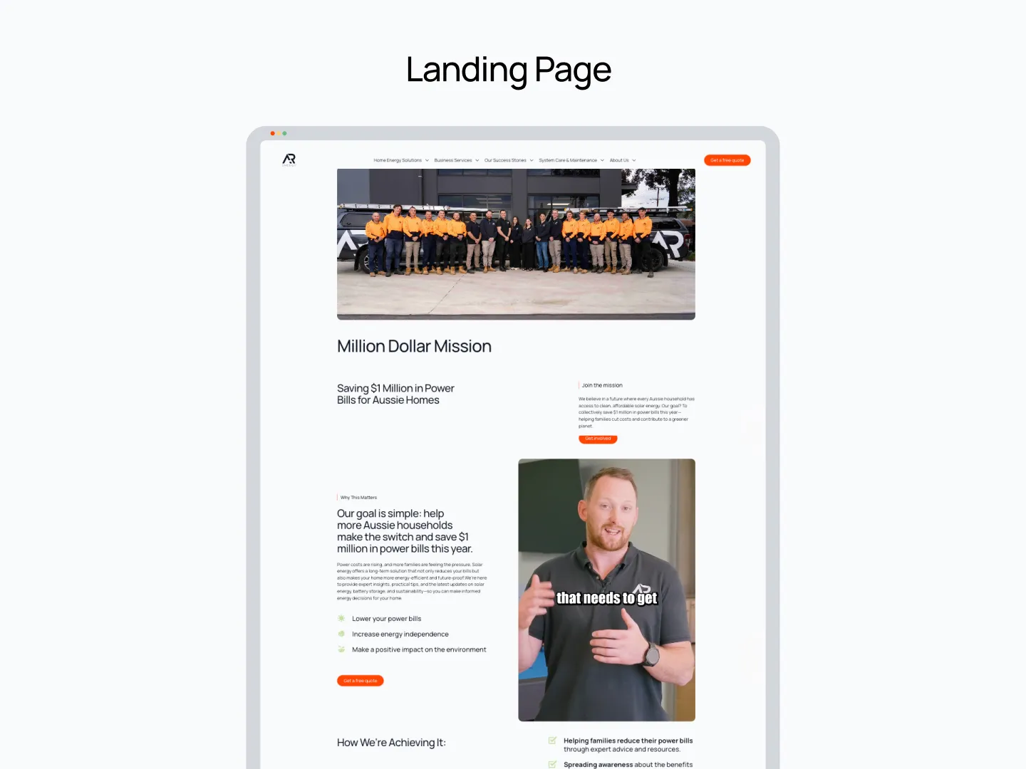
The campaign succeeded. AR Energy hit the goal in 10 months, documenting 183 individual projects and $1.269 million in cumulative savings. The case study CMS and the landing page architecture I had built made that documentation possible.
Outcome
The site launched on 26 October 2024.
Commercial positioning achieved. The previous site communicated “residential solar installer with a mate’s website.” The new site communicates “serious commercial operator with a documented track record.” The visual system, CMS, and case study architecture all serve that positioning.
The Million Dollar Mission landed. AR Energy publicly committed to saving $1 million in power bills for Australian households and achieved it within 10 months, documenting 183 projects and $1.269 million in total savings. The landing page and content infrastructure I built were part of how they told that story.
Brand system proved its value. Seven months after launch, AR Energy invested another $1,800 in extending the brand into social media templates. That follow-on investment happened because the original system was robust enough to be worth extending, not rebuilding.
Long-term asset in place. The case study CMS means the team can document new commercial projects without coming back to a developer. As the business grows, the site grows with it. Eighteen months after launch (April 2026), AR Energy continues to actively use and update the system — adding new case studies, managing content independently, and running their ongoing commercial operations through the platform. The system was built to be maintained by their team, not dependent on external development. That was the whole point.
Why They Needed Me
- This project breaks without the platform decision. Staying on a cobbled Shopify setup meant staying in a visual category that was wrong for their commercial ambitions. Recommending Webflow and holding that position against the familiar option was the first real call on this project.
- This project breaks without a visual system built to extend. A website refresh without a proper design system produces a site that looks good at launch and fragments in six months. The light and dark theme, the colour system, the typography rules: those are what made the social media templates coherent seven months later.
- This project breaks without the GSAP case study system. Commercial tenders require documented proof. A static project grid doesn’t cut it for million-dollar contracts. The custom case study CMS was the commercial infrastructure the business needed, not a design flourish.
- This project breaks without someone who can direct production across contributors. The capability statement and social media templates were produced with external contributors. Holding quality across that work, briefing clearly, reviewing against the brand, and pushing back when needed, is what kept the brand consistent at every touchpoint.
- This project breaks without the Million Dollar Mission infrastructure. AR Energy’s most significant commercial achievement needed a platform to document and share it. The landing page, the case study CMS, and the content architecture made that possible.
cam notes:
“No store, just a blog template that had long since been outgrown”. It was a storefront, with no store, and they were trying to add blogs in some weird way, i can’t remember, anyway, not fit for purpose.
“That kind of pushback is worth having when the logic is sound.” what does this mean? I think he came around to what i told him the colour was communicating to potential customers. with this new knolwedge he embraced the design decision after it sat with him for a while
“Format Digital joined as AR Energy’s social media agency, I worked with Rebecca Tatarelli ” do we need to name either of these? I like working with Format, but we don’t need rebecca mentioned by name do we?
gemini notes:
Areas for Polishing Name Check: In your initial prompt, you mentioned “Brandan and Aidan.” In the case study, you’ve listed “Brandon Foster.” (My internal search earlier suggested Brandon Connolly—you might want to double-check which one is correct before this goes live!)
The Capability Statement: You mentioned this went through “two rounds of production before it held to the standard.” You could sharpen this by briefly saying why the first round failed (e.g., “The initial draft felt too ‘retail’ and lacked the technical depth required for commercial procurement”). It reinforces your role as the “Quality Gatekeeper.”
Visual Language: You mentioned the “Navy Logo was staying.” It might be worth adding one sentence about the typography shift. If you moved from a casual font to something more architectural or industrial, that’s a huge part of the “commercial” feel.
Suggested Tweaks to the Text Current: “The tradeoff was a longer, more expensive project upfront.” Tweak: “The tradeoff was a higher upfront investment, but it eliminated the ‘technical debt’ of a platform that couldn’t scale.” (Using terms like “Technical Debt” appeals to high-end clients.)
Current: “Aidan came around on it. That kind of pushback is worth having when the logic is sound.” Tweak: “Aidan eventually agreed. This reinforces a key belief of my practice: strategic friction often leads to the most durable brand decisions.”