Moving Puzzles Brand System
Movement practitioner with a complex abstract framework. Built a visual language that became a teaching tool and scaled across workshops, merchandise, and digital presence.
Moving Puzzles Brand System
At a Glance
- Client: Dean Philp (Moving Puzzles)
- Project: Brand strategy, identity system, Webflow site, collateral design, facilitator training materials
- Timeline: November 2022 to June 2023
- Scope: Visual identity system, logo, colour and typography, Webflow site with custom animation, Canva templates, merchandise, communication patterns book
- Key result: Brand scaled across workshops, retreats, team-building programs; facilitator training delivered; book published; online store in development
Problem
Dean Philp had built a sophisticated movement-based practice sitting at the intersection of Fighting Monkey, Parkour, Lego Serious Play, and embodied learning, with 20 years of AI research and 15 years of touch rugby coaching layered in. It’s a genuine melting pot. The core framework, the “Ecology of Practices”, is abstract and conceptually dense. It lives in the space between curiosity, courage, and creativity. The challenge wasn’t building a visual system to look at. It was building one that could teach.
Dean had developed his own Canva brand that was a good foundation for getting the practice off the ground. But as the workshops grew and he started targeting institutional clients like universities, the gap became clear. The visual communication was scattered: layered ideas, inconsistent language, no coherent anchor. People were showing up to group class wearing his logo, which made the timing obvious. The academic depth of the practice wasn’t reading through to prospects seeing the offering for the first time. The work was sophisticated; the visual communication made it look overwhelming.
The strategic requirement was sharper than a typical positioning project. The brand had to do two jobs simultaneously: first, signal to institutional buyers (universities, corporates, councils) that this was serious methodology, not wellness theatre. Second, function as a teaching system itself: the colours, the language, the visual structure needed to help facilitators and participants understand and remember the framework.
Scope and constraints:
- Abstract subject matter requiring visual translation of complex conceptual frameworks
- Founder is highly tech-savvy and needed to manage the site independently post-launch via Webflow
- Multi-modal deliverables: digital presence, physical merchandise, facilitator manuals, workshops, retreats
- The brand needed to work across vastly different contexts: formal university workshops, community classes, private coaching, and nationwide retreats
Approach
1. Mapped the abstract concepts before touching aesthetics
Rather than start with style, I worked through the conceptual structure first. The “Ecology of Practices” rests on three pillars: Curiosity, Courage, Creativity. Before any logo or colour emerged, I anchored these as the strategic foundation.
Dean had already identified these pillars. The decision I made was to make them visible and functional in the brand system rather than hidden, and to build on what he’d started rather than wipe it and begin fresh. A weak approach would embed them semantically and hope the audience absorbed them. The choice was to make them explicit: colour, language, application logic, so they’d teach the framework to anyone encountering the brand.
2. Explored three visual directions before landing on Jumbled Letters
Dean had the name, Moving Puzzles, and an existing DIY brand. The work wasn’t naming. It was visual language: how do we translate what Dean does into a mark that makes the right impression fast?
Three directions were explored:
- Tangram: Geometric shapes forming human figures representing Curiosity, Courage, Creativity. Strong visual story, clear conceptual narrative.
- Risograph: Layered textures and printmaking aesthetic, capturing the iterative and accumulative nature of the practice. Visually exciting but niche.
- Jumbled Letters: The MVP letters fractured and reassembled, characters stacked at angles. Chaotic enough to signal “unconventional”, ordered enough to read as intentional.
3. Rejected Tangram, developed Jumbled Letters
Dean liked the narrative in the Tangram concept but recognised it didn’t match the brand positioning. The practice is about breaking rules and reforming. The human figures were too static, too resolved.
The Jumbled Letters direction emerged as stronger. The visual captures the core principle: breaking established patterns and reordering them. > “It’s a very different logo concept to what I have ever seen.” — Dean Philp
He specifically requested that I keep the Curiosity, Courage, Creativity story but apply it to the abstract letter forms instead of human figures. That’s exactly what the colour system does.
4. Built the colour system as a teaching framework
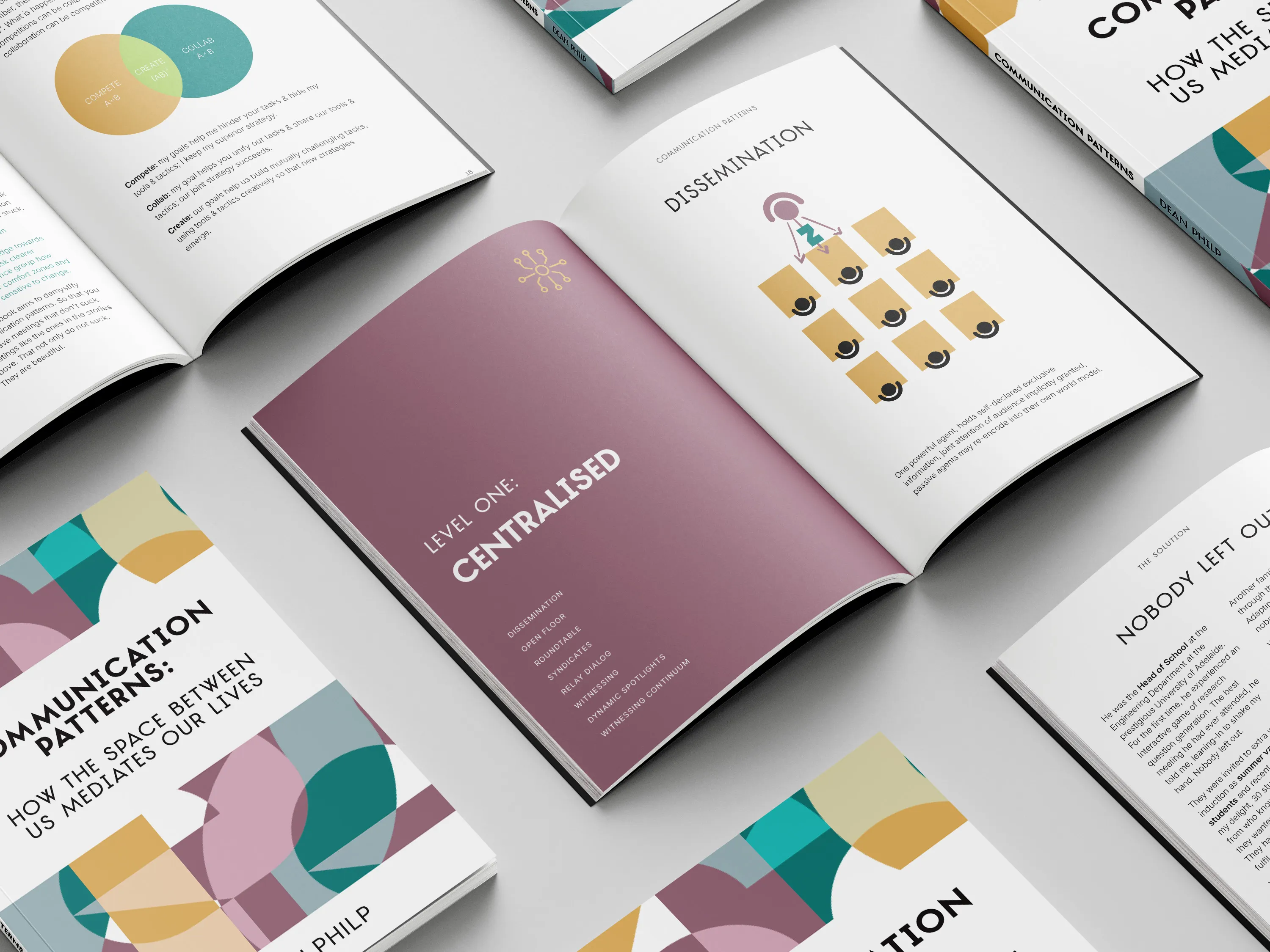
Three core colours, each mapped to one pillar:
- Green (Curiosity): Represents zooming and focusing, the exploratory mindset
- Purple (Courage): Represents risk and the willingness to try, the vulnerability required to learn
- Yellow (Creativity): Represents composition and creation, the emergent outcome
These aren’t decorative. In the brand guidelines and on the site, the three colours appear in specific contexts to reinforce which pillar of the framework is at work. A facilitator using the brand materials gets visual reinforcement of the structure. A participant in a workshop sees the colours and recognises the concepts being introduced.
The palette is also deliberately unusual for the fitness and wellness industry, where black and red tend to dominate: aggressive, loud, performance-driven. This palette reflects something different: the courage it takes to look inwardly, to be uncomfortable, and to grow under the supervision of a leader like Dean.
5. Built the Webflow animation to visualise the abstract concept
The site includes a custom “Ecology animation” where different practice elements move and eventually coalesce into a single circle. This isn’t decoration. It’s a visual metaphor for the framework itself: many distinct practices coming into coherent alignment.
Dean’s feedback: “I like how it all comes together in one circle.”
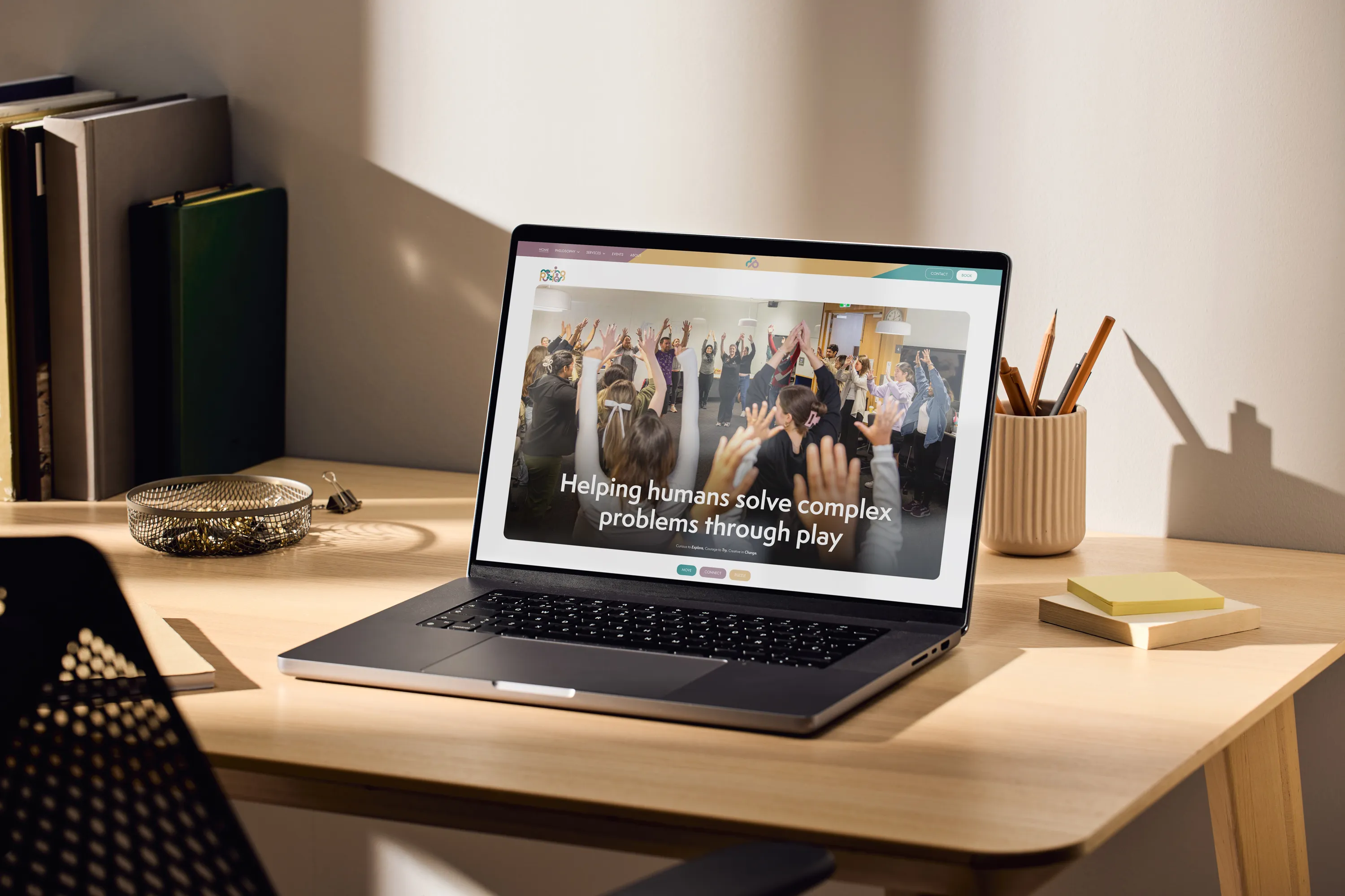
The technical choice was to build this custom rather than use a template animation. A generic animation would have undermined the positioning. The animation needed to show the specific relationship between the elements of Dean’s practice.
6. Tapped Dean’s technical capability to get the site right
Dean has a software engineering background. Rather than treat that as a complication, I removed every technical barrier and gave him agency to shape the structure directly from his own mind.
I built the wireframe, then handed it to Dean to populate the messaging and adjust the layout. He was editing the wireframes himself by December 2022. This was deliberate: his concepts live in his head, not mine. Guessing at the layout would have meant iteration loops and wrong assumptions. By tapping his capability, we got a foundation that was genuinely his, which I then developed into a Figma design and custom Webflow build.
Most clients can’t do this. When one can, treating it as a threat to your role is the wrong move. The consultant’s job is to remove friction and let the client focus on what only they can do: distilling their practice into a clear brief. The handover was architectural too: the site was structured so Dean could manage content independently via the Webflow editor long after the project closed.
Outcome
The brand launched publicly in December 2022 with the landing page, then expanded to full site by June 2023.
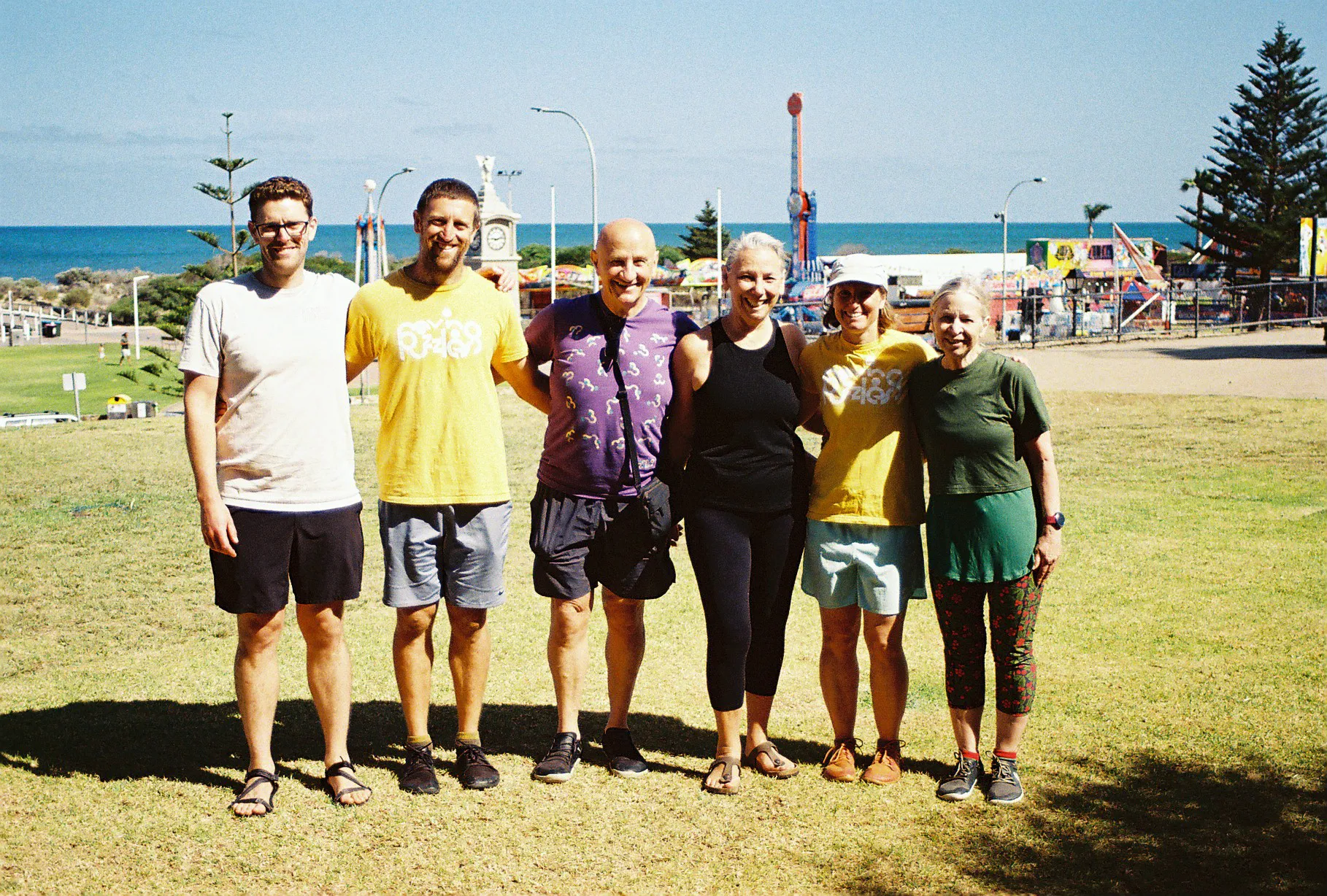
Workshop and institutional adoption: The clearest business result is in Dean’s annual reports. In 2024, workshops were delivered at University of Adelaide (“Creativity and Shapes of Interaction”), University of South Australia (“Relationships in Motion”), Chartered Accountants AUNZ (Team Communication and Resilience), Rotary Youth Leadership, Cirkidz, and Touch Football South Australia. The branded methodology scaled across team development, coaching, workshops, and facilitation training.
Education rippling outward: The clarity of the brand system is making the methodology teachable beyond Dean. The framework can now be shared, communicated, and referenced consistently across different contexts because the visual language does the conceptual heavy lifting. The education is spreading because the system is legible.
Book and materials: A 56-page facilitator guide titled “Communication Patterns: How the Space Between Us Mediates Our Lives” was delivered in April 2026, covering three levels of practice (Centralised, Decentralised, Distributed). The book uses the three-pillar colour system throughout to reinforce the framework.
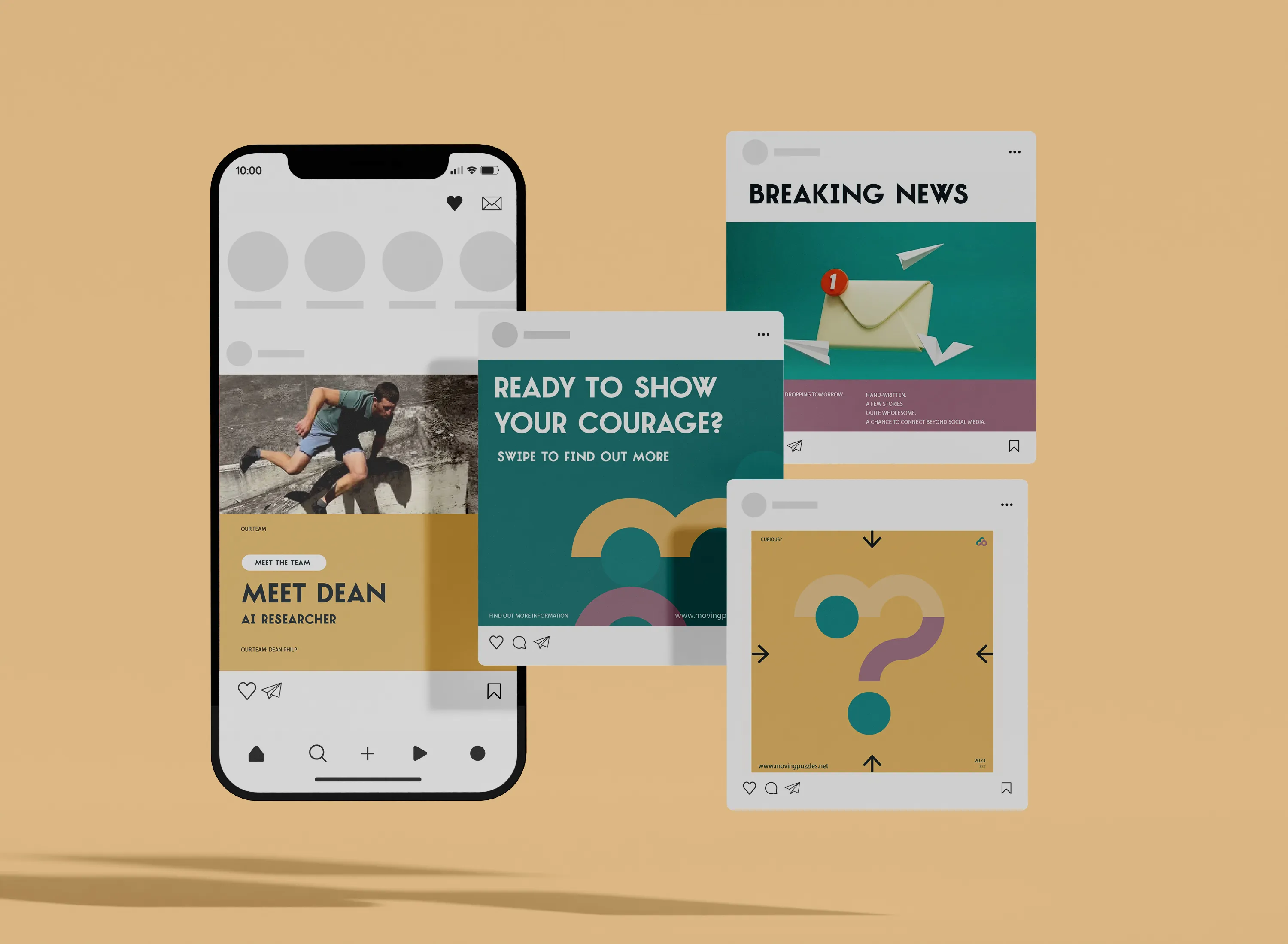
Branded extension: Canva templates were delivered so Dean could maintain brand consistency across newsletters and photography without needing a designer for every update. MVP merchandise (tees) was added to the professional wardrobe list in September 2023. An online store is in development for 2026.
Confidence to grow: Dean’s practice continues to expand nationally, and he’s been pursuing his own professional development internationally. The brand is built to carry that weight: he can walk into any room, anywhere, with something that reflects the seriousness of the methodology.
Why They Needed Me
- This project breaks without someone who has embodied the practice. I’m a student of Dean’s. I meditate and move daily. I came to this project as a practitioner, not a pixel pusher. Understanding the Ecology of Practices from the inside, not just as a brief, is what made it possible to translate abstract concepts into visual logic. A marketing agency that offshore-coordinates or a design studio chasing portfolio awards wouldn’t have had the frame to do this work.
- This project breaks without mapping the abstract concepts first. A designer focused on creating a “cool logo” would have produced something visually distinctive that taught nothing. The brand needed to carry the conceptual structure of the Ecology of Practices. That required starting with the framework, not the aesthetics.
- This project breaks without the three-pillar colour system. The colours aren’t arbitrary. They’re functional: they reinforce the framework for facilitators and participants, and they sit deliberately outside the aggressive black-and-red conventions of the fitness industry. A generic colour palette would have been forgettable. This one teaches every time it’s applied.
- This project breaks without the custom Webflow animation. A templated animation would have looked good but wouldn’t have conveyed the specific relationships Dean needed to teach. Building a custom animation that actually shows the Ecology coming together required someone who understood both the technical capability and the conceptual requirement.
- This project breaks without architectural thinking around handover. Dean needed to manage the site independently post-launch. “Handing over a Webflow site” isn’t the same as “handing over capability.” The site architecture, the template structure, and the training had to be designed so a non-developer could extend it without breaking it.
- This project breaks without treating the brand as a teaching tool, not a decoration. Every aspect of this work follows from that principle. The colour logic, the jumbled logo, the animation, the guidelines structure: they all exist to make the Ecology of Practices visible and repeatable. Without that lens, the brand becomes aesthetic rather than functional.