Pax Advisory Rebrand
Hospitality accounting firm with a brand that was holding them back. Renamed, repositioned, and rebuilt from the ground up, including the lead-gen infrastructure to feed the business.
Pax Advisory Rebrand
At a Glance
- Client: Pax Advisory (formerly Nuevo Accounting & Advisory)
- Project: Strategic rebrand: naming, identity system, website, lead-gen infrastructure
- Timeline: July 2023 to Jan 2025
- Scope: Brand strategy and sprint, naming, logo system, brand guidelines, website development, lead-gen automation
- Key result: Full rebrand launched Jan 2025; Big Shed Brewing, La Buvette Drinkery, and Exchange Hotel Gawler signed as case study clients post-launch
Problem
Brendan and Belinda Connolly had built twenty years of hospitality accounting expertise under the name Nuevo Accounting & Advisory. The name was the problem. Clients struggled to spell it and explain it. The brand looked like any other accounting firm: safe, inoffensive, indistinguishable from every other practice in the market. None of the hospitality specialist depth they had actually built was visible to a prospective client seeing the name for the first time.
The accounting market for independent hospitality venues is narrow and relationship-driven. In Adelaide, that audience is concentrated enough that reputation travels fast, but it also means a weak brand signals something. Nuevo wasn’t signalling the wrong thing. It wasn’t signalling anything: not the hospitality expertise, not the values, not the kind of clients they had built their whole practice around.
The brief was a full rebrand: new name, new identity, new website. But the underlying problem was strategic. Brendan and Belinda needed to be positioned not just as accountants, but as hospitality-specialist growth partners, people who understood the emotional and operational reality of running a venue, not just the compliance obligations.
Scope and constraints:
- Budget: under $10k across brand and website
- Stakeholders: Brendan and Belinda as joint decision-makers, both with strong instincts and views on direction
- Timeline: a condensed strategy phase with a long tail to full go-live (Jan 2025), shaped by a staged rollout, client transition management, and a significant business pivot partway through. Major clients left the practice during the engagement, and AHB was acquired. Good consulting means adapting the brief to what the business actually needs, not what it needed when the contract was signed.
- The compliance vs. credibility tension: the brand had to signal compliance competence (the foundation clients need to trust you) while leading with growth partnership (the reason to choose Pax over anyone else). Too far toward “safe and proper” and the brand disappears into the market. Too far toward “ambitious and different” and clients question whether the fundamentals are covered.
Approach
1. Ran a brand sprint before touching any design
Before naming, logo, or visual direction, I ran a structured brand sprint to lock strategic alignment. I used Personality Sliders to anchor where Pax would sit on axes that mattered:
- Serious vs. playful: deliberately centred
- Conventional vs. rebel: leaning rebel, to flip the expectation for an accounting firm
- Friend vs. authority: leaning friend, to emphasise the partnership model over compliance-first positioning
I chose to front-load this rather than move straight to naming concepts because naming errors are expensive to fix after the logo is done. In a high-trust context like financial advisory, a name that feels right to the founders but reads wrong to the audience causes problems that cost more to fix than the sprint saves. The tradeoff was a slower start; the return was that every subsequent decision had a tested strategic foundation behind it.
The sprint also established the core principle: distinctiveness over differentiation. It is genuinely difficult for any accounting firm to be objectively “better.” What is achievable is being distinctive enough that the right client recognises themselves in the brand and the wrong client self-selects out.
2. Chose the name through elimination, not inspiration
The naming process started by ruling out categories, not generating options at a desk. My process for this is embodied: I hired the biggest thesaurus I could find from the library, took it to a pub, and worked through it from top to bottom, sitting with the physical weight of the language, turning pages rather than running searches. A time for human thinking, not a shortlist of AI outputs. That pass produced the initial long list. Three directions were then explored seriously:
- Future Numery Collective (FNC): Proactive and community-focused, but too academic and clunky for a high-trust advisory context. Sounds like a collective, not a firm.
- Tilt: Conceptually interesting (looking at problems from another angle) but too abstract. Advisory clients need a name that builds confidence on first contact; Tilt invites a question instead of answering one.
- Purple Picket: Personal story-based, inspired by Brendan and Belinda’s home. Warm and memorable, but it didn’t signal hospitality specialism at all. A new client hearing “Purple Picket Advisory” has no framework for what that firm does.
Pax won because it solved the problems Nuevo had created: one syllable, impossible to misspell, easy to say in a noisy venue over the phone. In hospitality, “pax” is industry shorthand for the number of guests in a booking, a name native to the audience it was trying to reach. It also carries a Latin root (peace, order) that positions the firm as the calm in the financial chaos most hospitality operators live in. A name doing two jobs at once. It also left room to grow: Pax Advisory can expand beyond hospitality without the name fighting the positioning.
3. Built the visual system around what Pax actually does
The logo symbol came from a moment I wasn’t trying to solve a design problem. I was dogsitting at Middleton Beach, doing a jigsaw puzzle in the evenings. Sorting the pieces was the hard part, so I googled whether there was a better method and came across a puzzle piece sorter. That was the logo for Pax: a tool for taking scattered, fragmented data and sorting it into a clear framework.
It is not the kind of symbol you recognise at a glance, the way an abacus reads. But the moment you see what it is, you get the connection. That “ah ha” response is what makes it work: the client who gets it understands the firm’s pitch without needing to read the tagline.
![]()
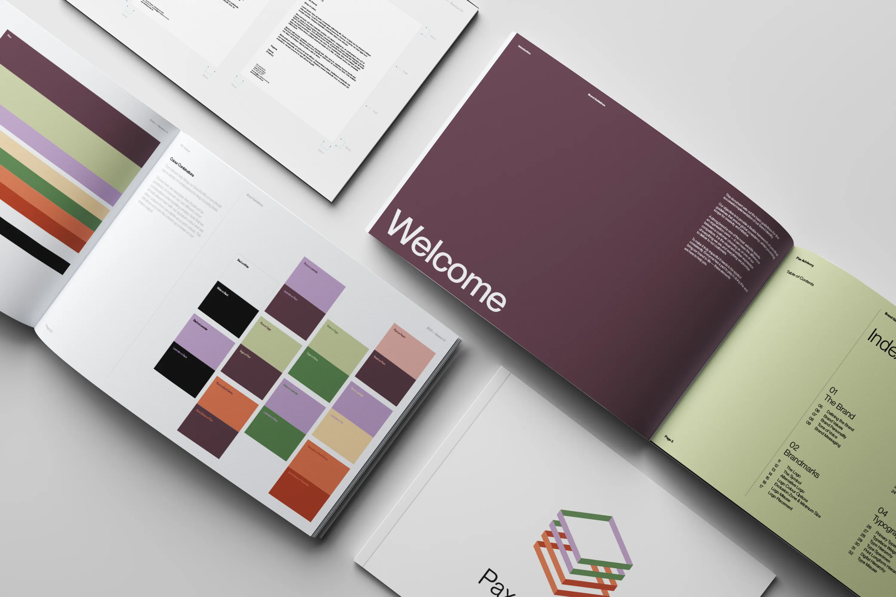
Colour: Plum as the signature. Every accounting firm in the Adelaide market uses blue or red. Plum was chosen specifically because it is the opposite of that expectation: distinctive enough to be remembered, sophisticated enough not to read as a novelty. The tradeoff is that it takes a more confident client to commit to it. Brendan and Belinda were that client.
Typography: Neue Montreal. Modern and bold enough to signal a contemporary firm, friendly enough not to feel cold.
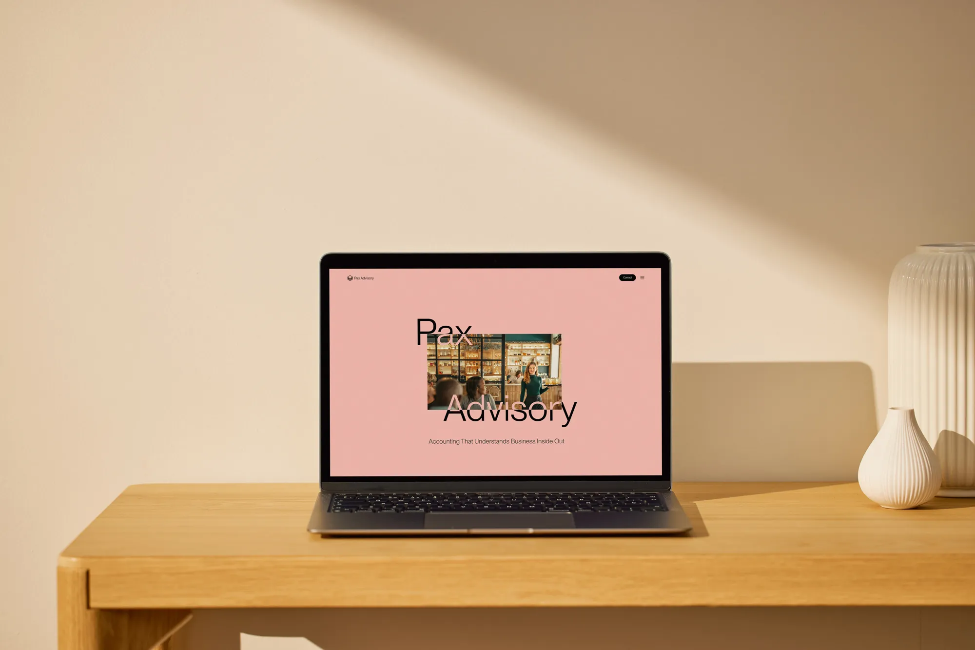
4. Built the website to feed the business, not just represent the brand
The website wasn’t a brochure. The brief included a lead-gen infrastructure: a Command Center for tracking response and close rates across multiple site forms, custom landing pages for ad campaigns, and integrated case study modules for publishing client proof.
One specific decision: Brendan wanted to use Excel for the lead-gen repository. I recommended Google Sheets instead. The reason was purely technical: Google Sheets has a native Zapier integration, which meant faster setup, less friction, and no extra authentication steps. The tradeoff was asking the client to change tools. The outcome was a system that worked reliably from day one without requiring ongoing maintenance.
Outcome
The rebrand launched publicly on 6 Jan 2025. In April 2026, Brendan messaged to say he had received two unsolicited comments about the Pax website in two days.
Post-launch, Pax secured and published case studies with Big Shed Brewing, La Buvette Drinkery, and Exchange Hotel Gawler: three credible hospitality venues that function as proof of the specialist positioning the rebrand was built to enable.
The lead-gen system now tracks incoming business from multiple hospitality entities centrally, replacing a fragmented process. Response and close rate data flows through the Command Center rather than sitting in inboxes.
The name friction is gone. The firm is easier to refer, easier to find, and easier to explain. The specialist positioning is visible before a prospective client has spoken to anyone.
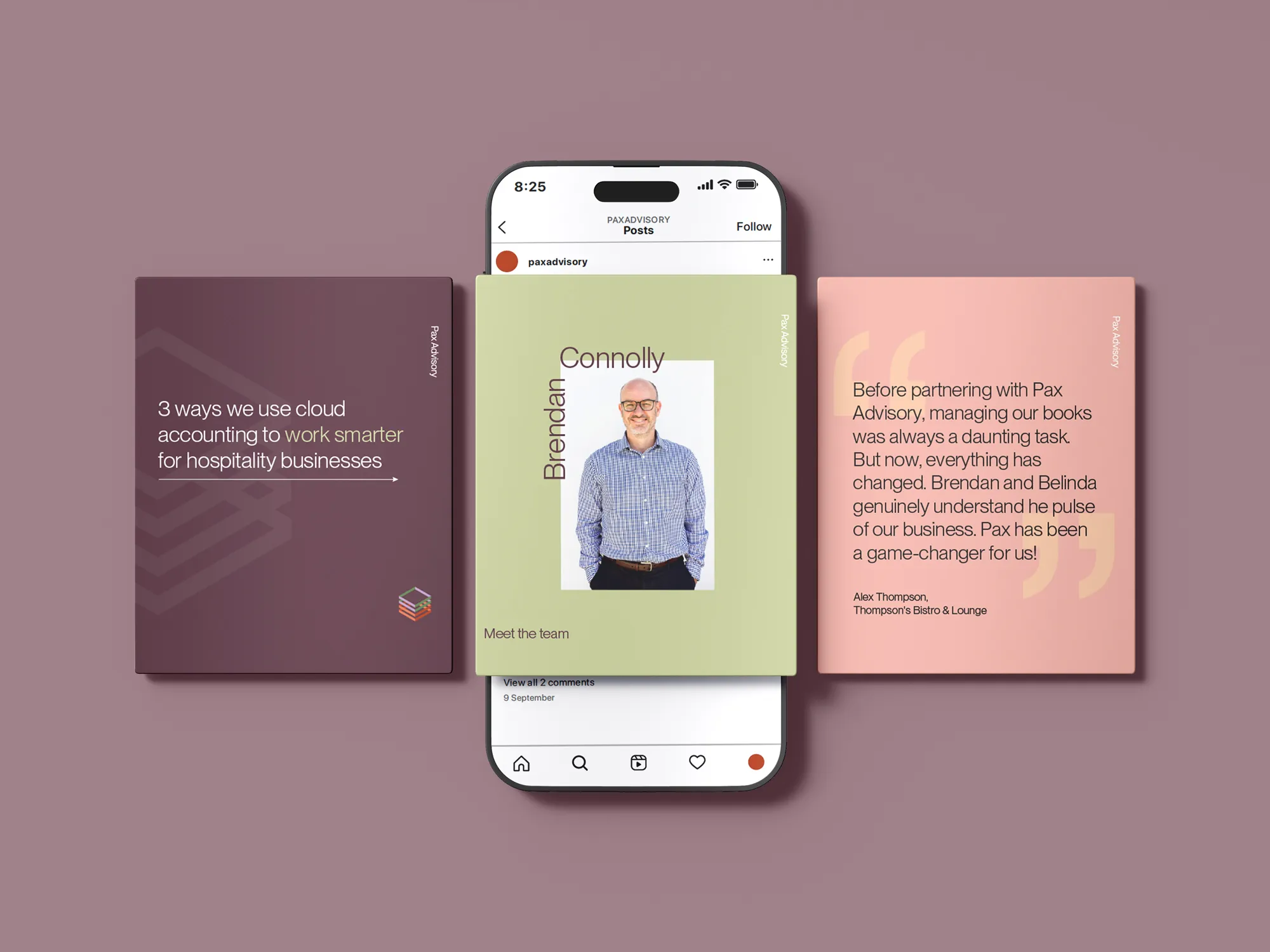
“When we started this process we were still Nuevo. The name caused friction every time we explained it to someone. Cameron walked us through what the rebrand actually needed to do strategically before we touched anything visual, and that made every decision after it easier to land. Choosing a name is harder than it sounds. We went through a few directions before landing on Pax, but looking back, it was the right call. No regrets. Since the rebrand launched we’ve got our case studies up with existing clients who were long overdue, something we couldn’t have done without the foundation Cameron built. We refer to him without hesitation.”
Brendan Connolly and Belinda Robb, Pax Advisory
Why They Needed Me
- This project breaks without the sprint. A naming process without strategic alignment first produces a name the founders love and the market misreads. The sprint made every downstream decision defensible, including the ones that required pushing back on directions that felt right but read wrong.
- This project breaks without the right naming process. Getting to Pax required a physical, embodied approach: a thesaurus, a pub, working through language by hand. That surfaces options that desk-based searching doesn’t reach, and produces a longlist with enough material to eliminate properly.
- This project breaks without the symbol logic. A distinctive colour palette alone is a style choice, not a brand. The Piece Sorter gave the identity a conceptual anchor that connected the visual to the service. Without that, Plum is just an unusual colour for an accounting firm.
- This project breaks without the lead-gen infrastructure. A beautiful website that doesn’t feed the business is a sunk cost. Building the Command Center and integrating the Zapier automation meant the site worked as a commercial asset from launch, not just a brand statement.
- This project breaks without someone who can hold the line on distinctiveness. The safest version of this project is a cleaner Nuevo: new name, same conservative visual language. That would have been easier to approve and would have produced the same result: a brand that doesn’t resonate with the hospitality audience they were trying to reach.